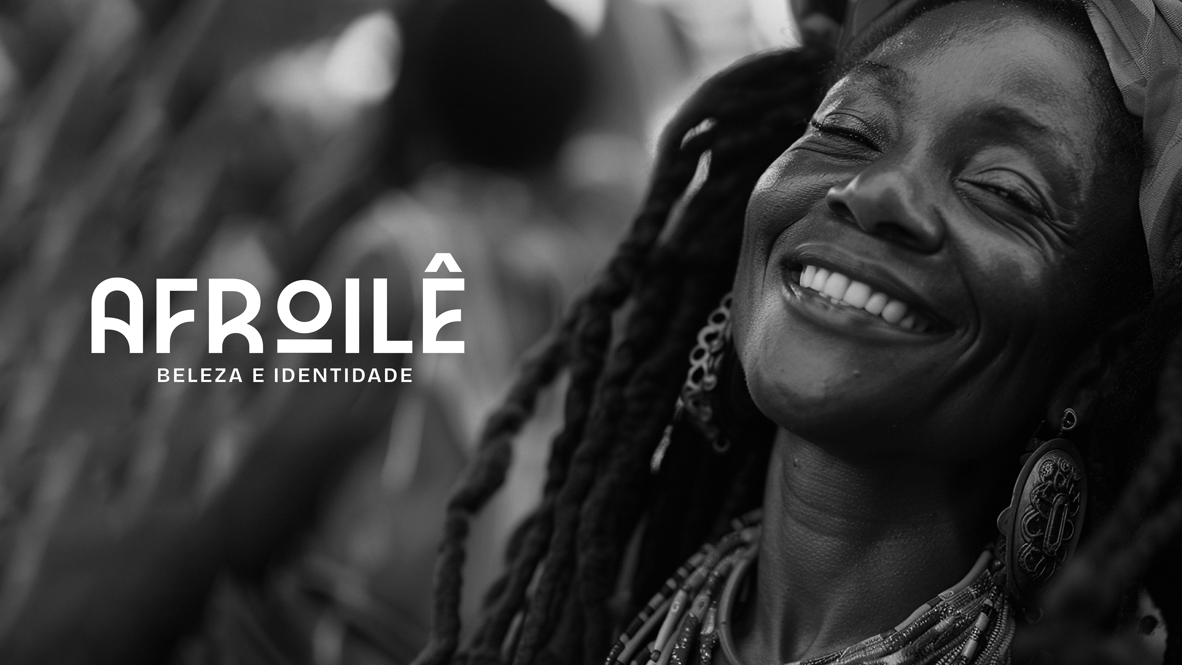
Afroilê
PT.
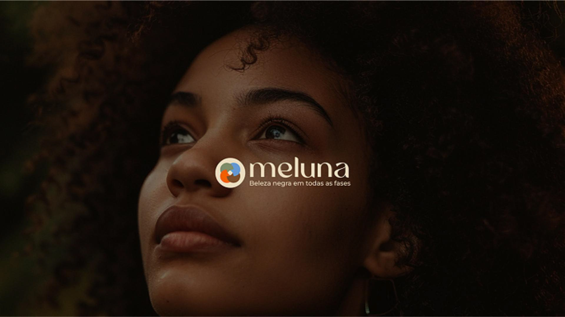
A AfroIlê nasceu da união de diferentes serviços prestados por uma mesma família, conectados por identidade, ancestralidade e propósito em comum. O desafio do projeto foi estruturar estrategicamente a marca e criar uma identidade visual capaz de representar essa diversidade de atuações sem perder coerência, força cultural e posicionamento profissional.
O projeto nasceu em São Paulo, cidade marcada pela diversidade cultural e pelas múltiplas conexões sociais, cenário que também influencia diretamente o posicionamento da marca.
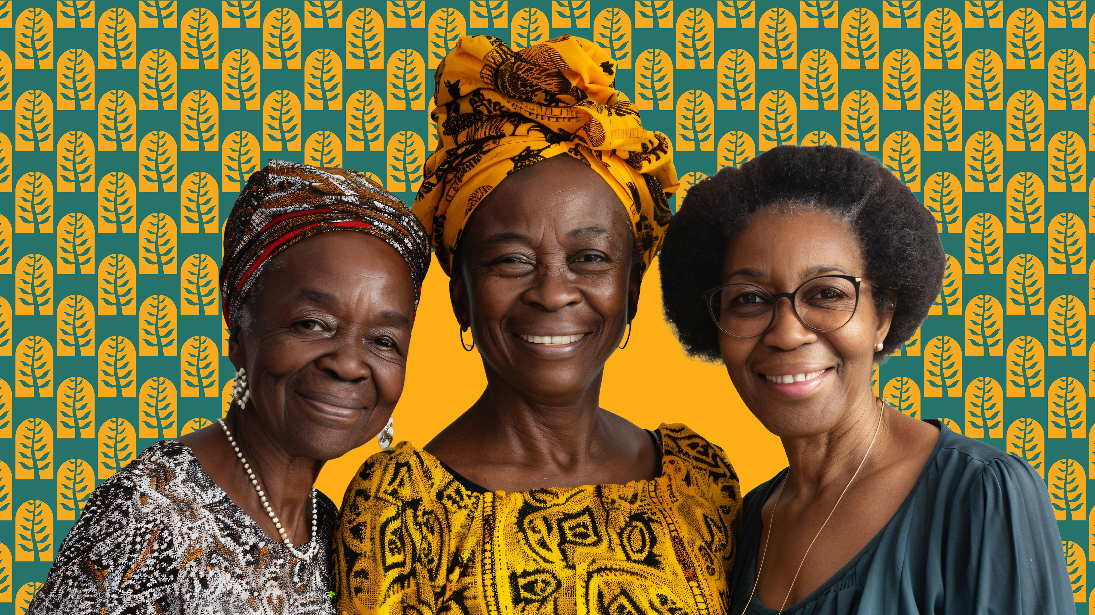
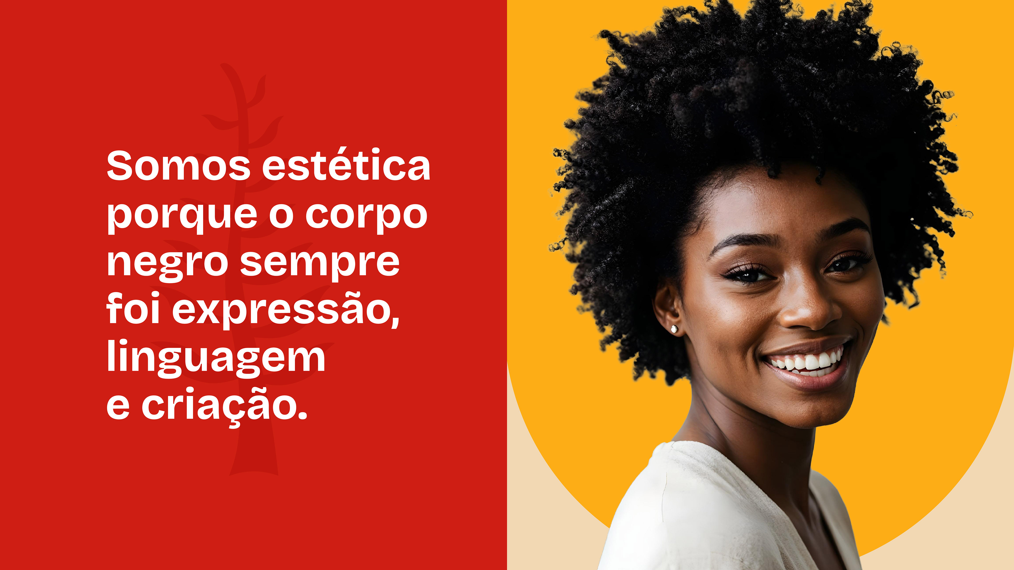
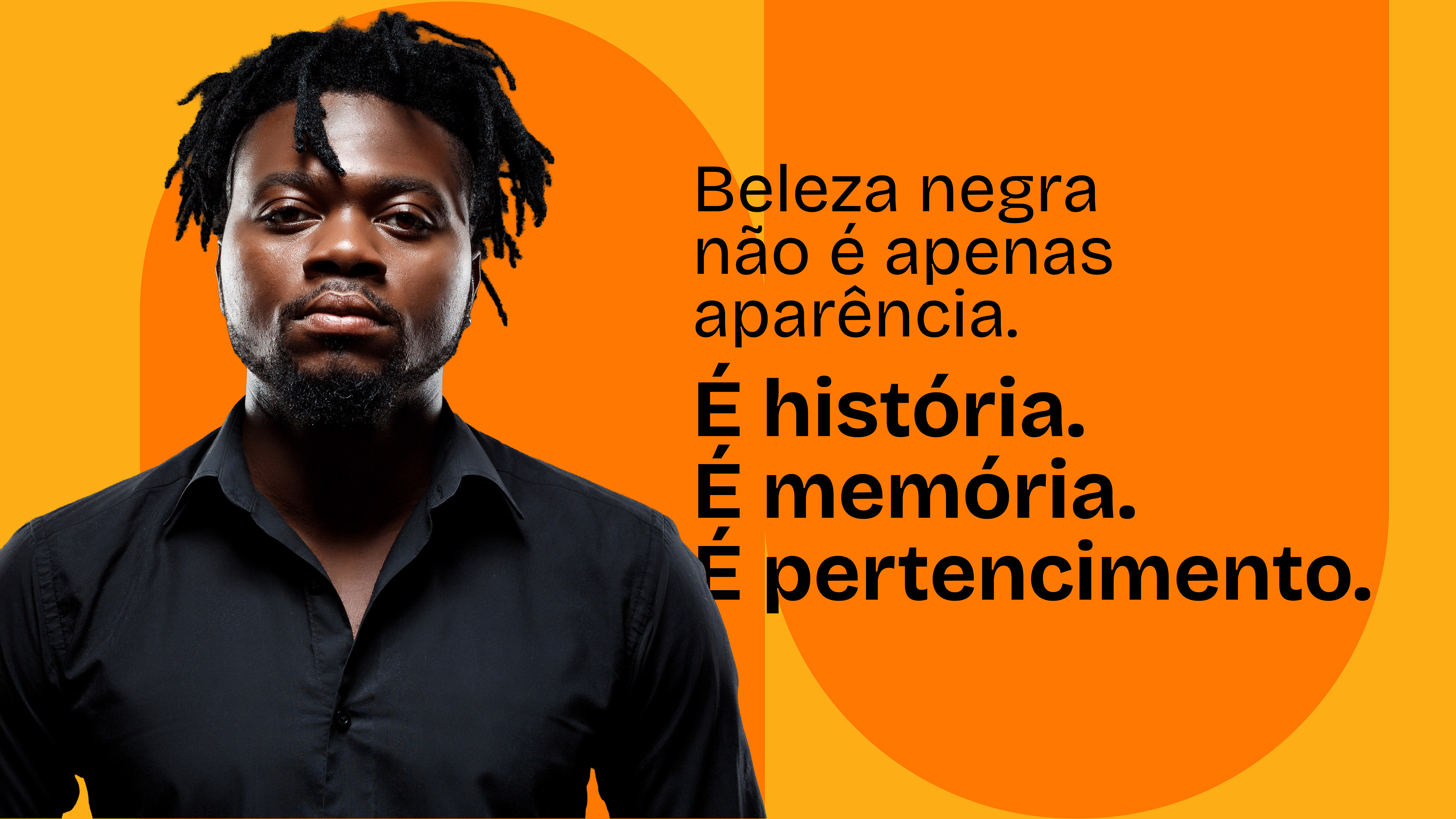
Desenvolvemos o planejamento estratégico da marca, a identidade visual e a direção artística do projeto, construindo um sistema visual afrocentrado baseado em pertencimento, memória e acolhimento. A nova marca posiciona a AfroIlê como uma empresa que une estética, cultura e identidade em uma comunicação mais consistente e autoral.
EN.
AfroIlê was born from the union of different services provided by the same family, connected by identity, ancestry, and a shared purpose. The challenge of the project was to strategically structure the brand and create a visual identity capable of representing this diversity of activities without losing coherence, cultural strength, and professional positioning.
The project originated in São Paulo, a city marked by cultural diversity and multiple social connections, a scenario that also directly influences the brand's positioning.
We developed the brand's strategic planning, visual identity, and artistic direction, building an Afrocentric visual system based on belonging, memory, and acceptance. The new brand positions AfroIlê as a company that unites aesthetics, culture, and identity in a more consistent and original communication.
Ficha técnica
Projeto: Branding e identidade visual
Cliente: Afroilê
Serviços: Planejamento estratégico de marca, posicionamento, identidade visual, direção artística, sistema visual, direção fotográfica e criativa
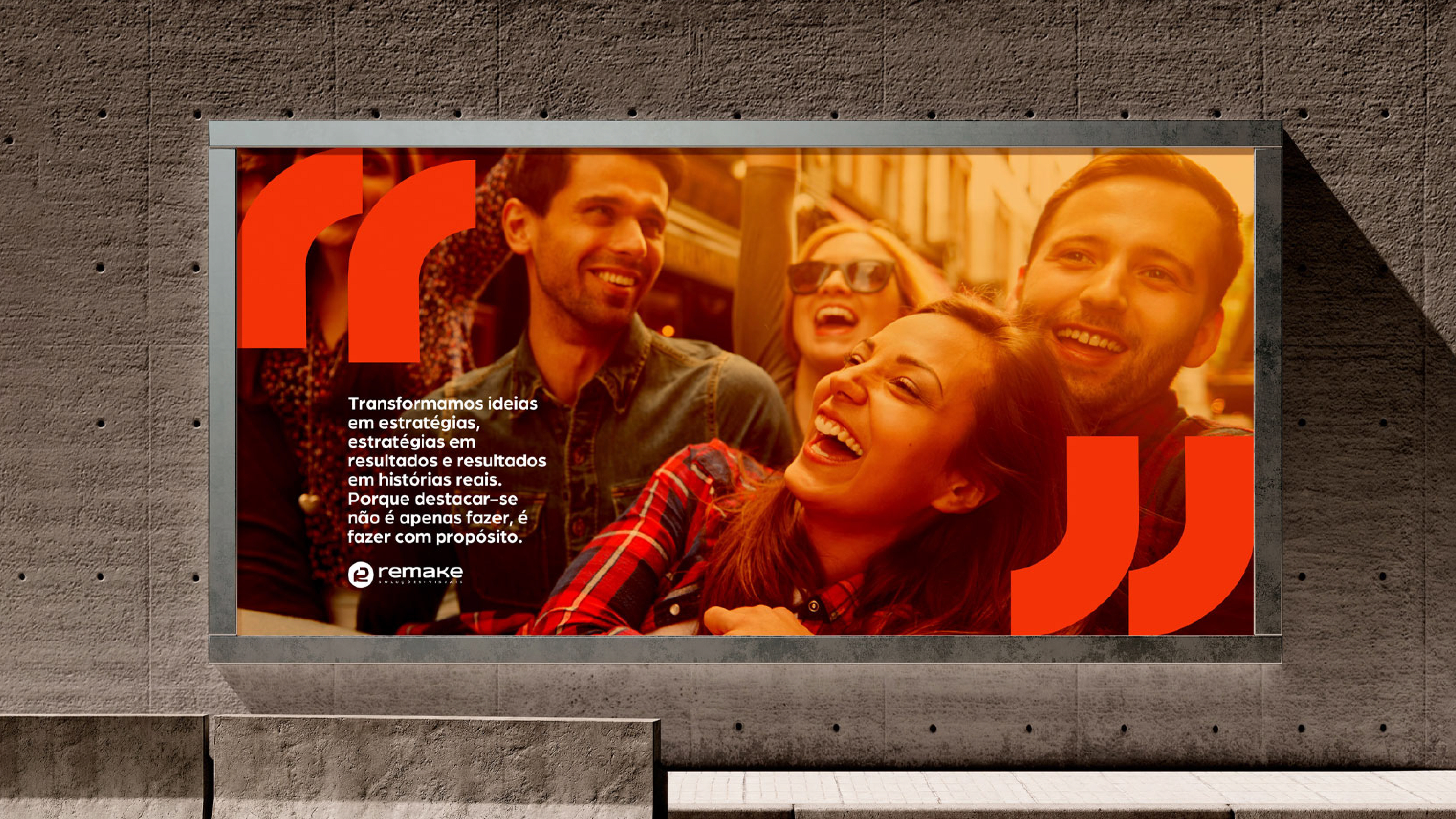
Desenvolvido por Remake Soluções Visuais | Todos os direitos reservados
Projeto: Branding e identidade visual
Cliente: Afroilê
Serviços: Planejamento estratégico de marca, posicionamento, identidade visual, direção artística, sistema visual, direção fotográfica e criativa
Desenvolvido por Remake Soluções Visuais | Todos os direitos reservados
O desafio
PT
O principal desafio foi construir uma marca que conseguisse representar diferentes serviços e personalidades dentro de uma mesma estrutura visual e conceitual.
Além disso, era fundamental desenvolver uma identidade afrocentrada autêntica, evitando estereótipos ou construções visuais superficiais frequentemente associadas a marcas com temática cultural.
A marca precisava equilibrar:
- Identidade cultural forte
- Sensação de acolhimento e pertencimento
- Posicionamento profissional
- Flexibilidade para múltiplos serviços
- Coerência visual e narrativa
- Sensação de acolhimento e pertencimento
- Posicionamento profissional
- Flexibilidade para múltiplos serviços
- Coerência visual e narrativa
Também havia a necessidade de criar uma direção estética que funcionasse tanto institucionalmente quanto em comunicação digital e produção de conteúdo.
EN
The main challenge was to build a brand that could represent different services and personalities within the same visual and conceptual structure.
Furthermore, it was essential to develop an authentic Afrocentric identity, avoiding stereotypes or superficial visual constructions often associated with culturally themed brands.
The brand needed to balance:
- Strong cultural identity
- A sense of belonging and belonging
- Professional positioning
- Flexibility for multiple services
- Visual and narrative coherence
There was also a need to create an aesthetic direction that would work both institutionally and in digital communication and content production.
A estratégia e as decisões
PT
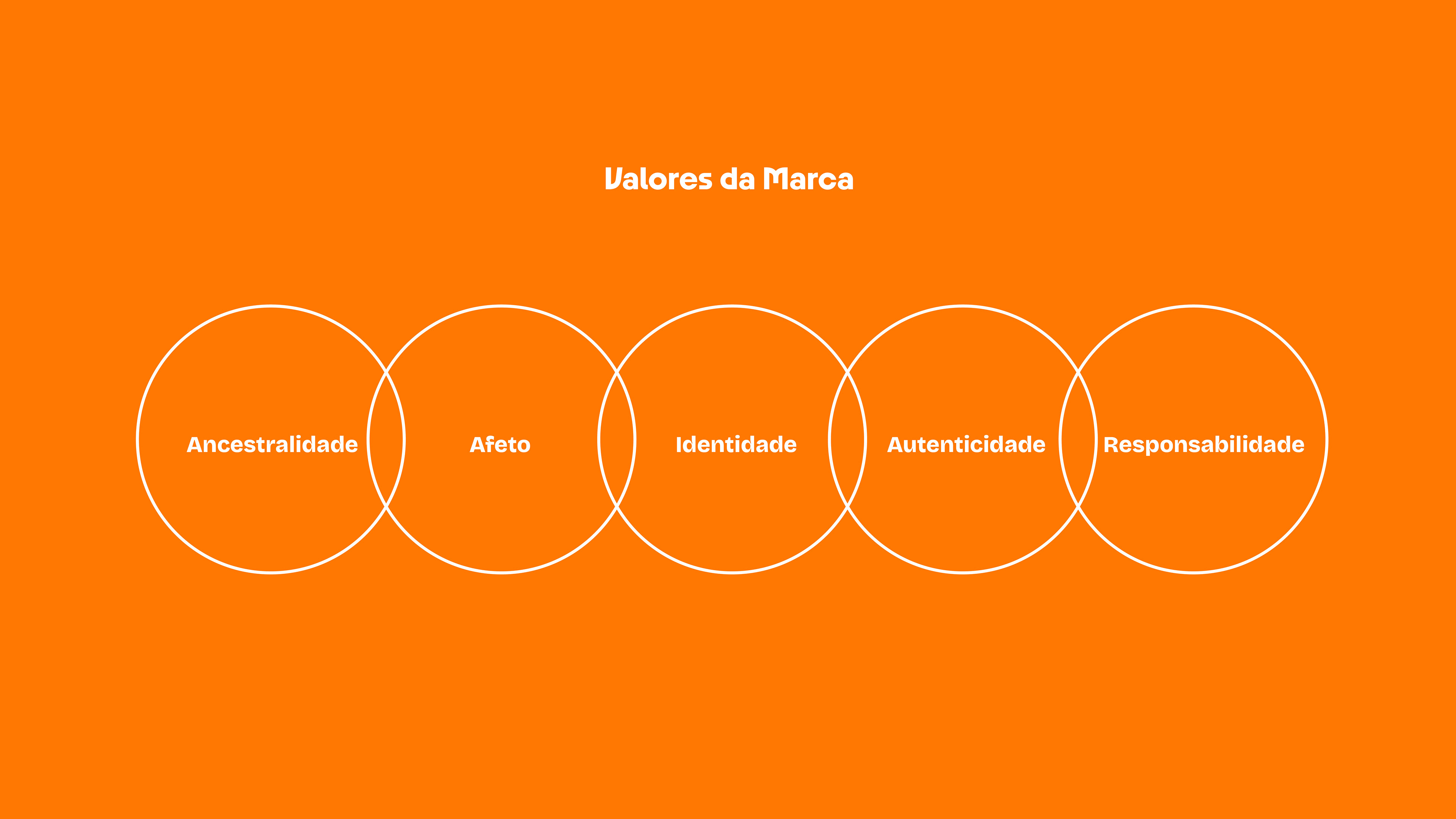
O projeto começou pela construção estratégica da marca. A partir da história familiar, definimos os principais pilares da AfroIlê: ancestralidade, afeto, identidade, autenticidade e responsabilidade. Esses conceitos orientaram todas as decisões visuais e verbais do projeto.
O próprio naming já carregava parte importante do posicionamento:
“Afro” ligado à identidade negra, ancestralidade e estética
“Ilê”, palavra de origem iorubá associada à casa, origem e pertencimento
“Ilê”, palavra de origem iorubá associada à casa, origem e pertencimento
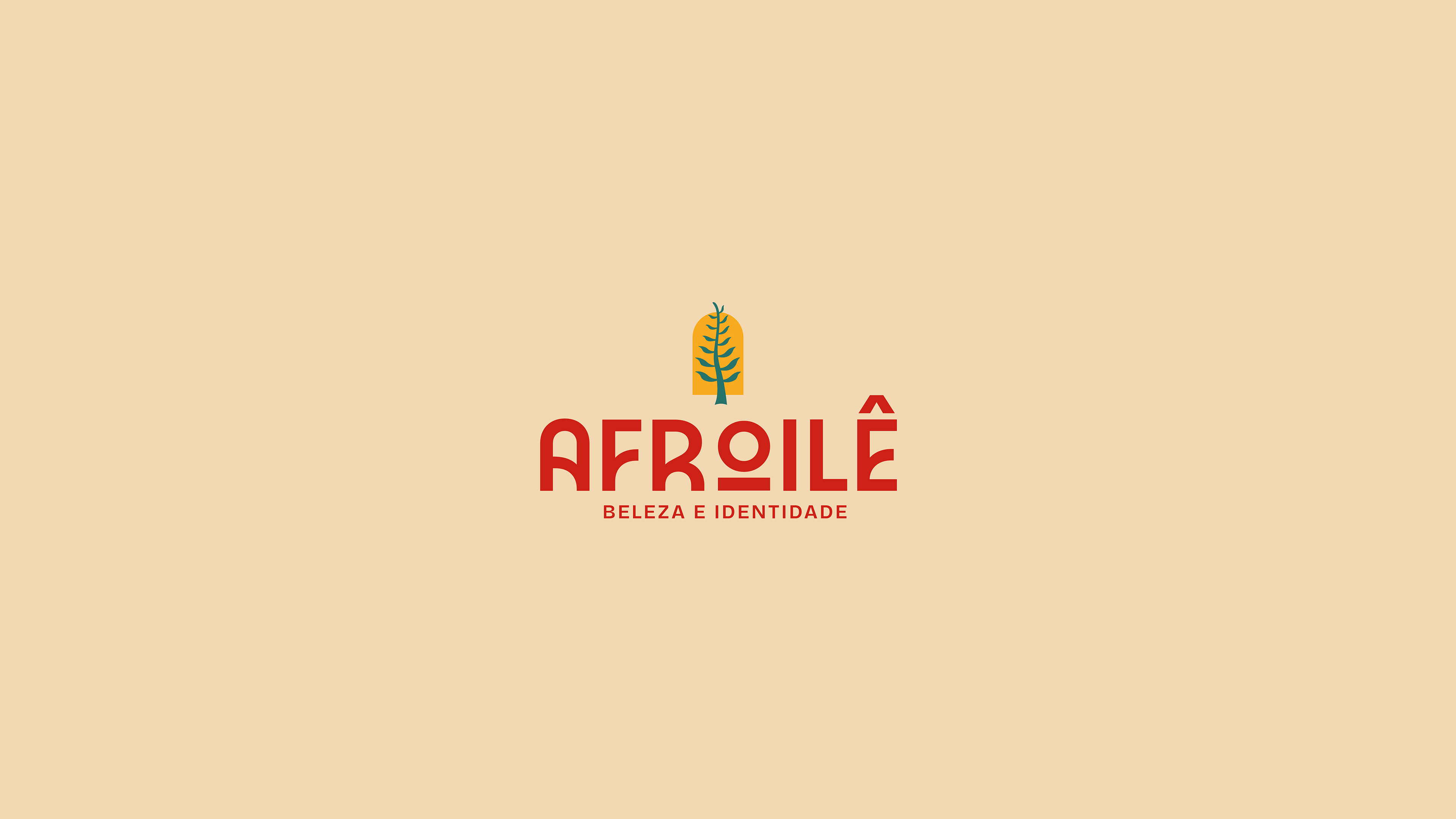
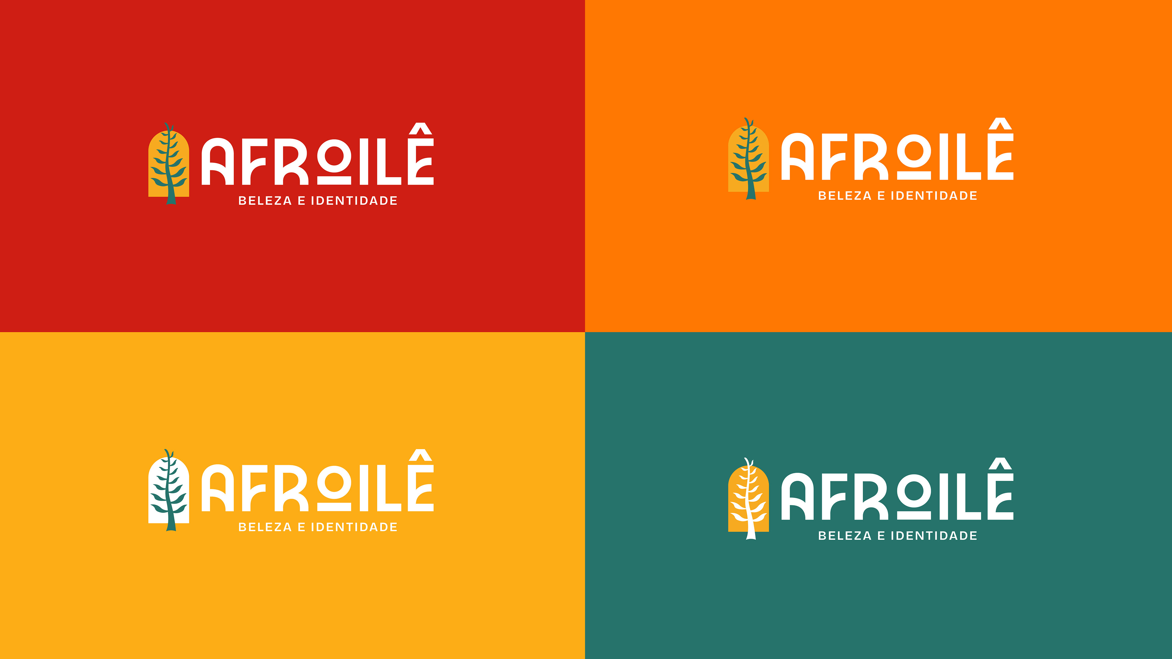
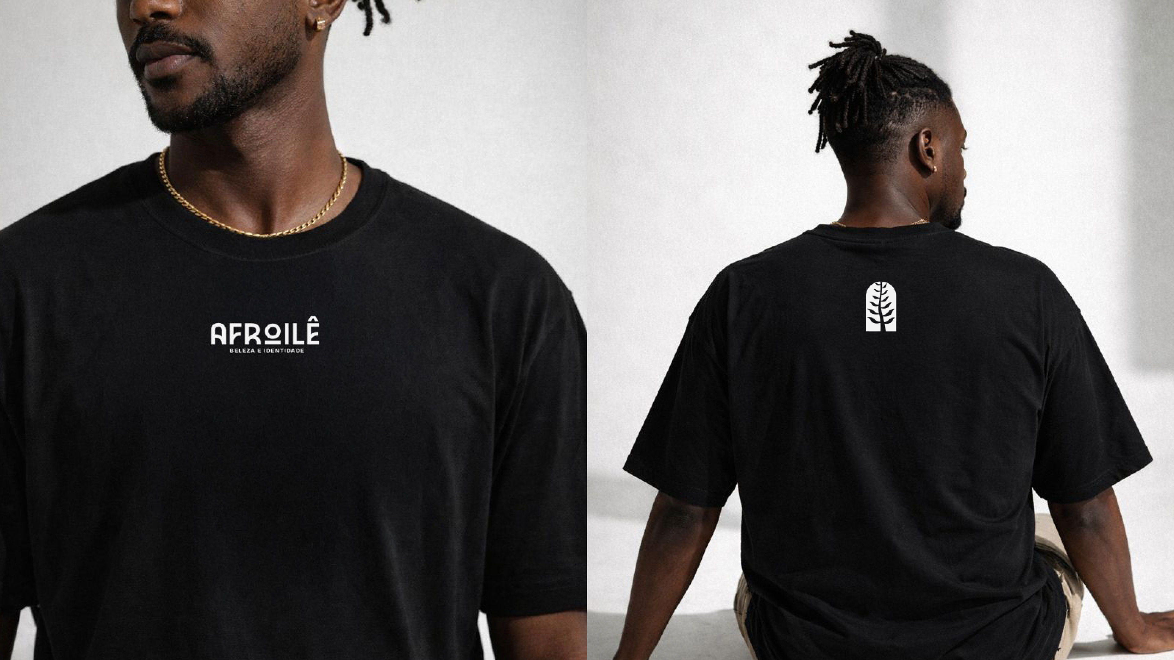
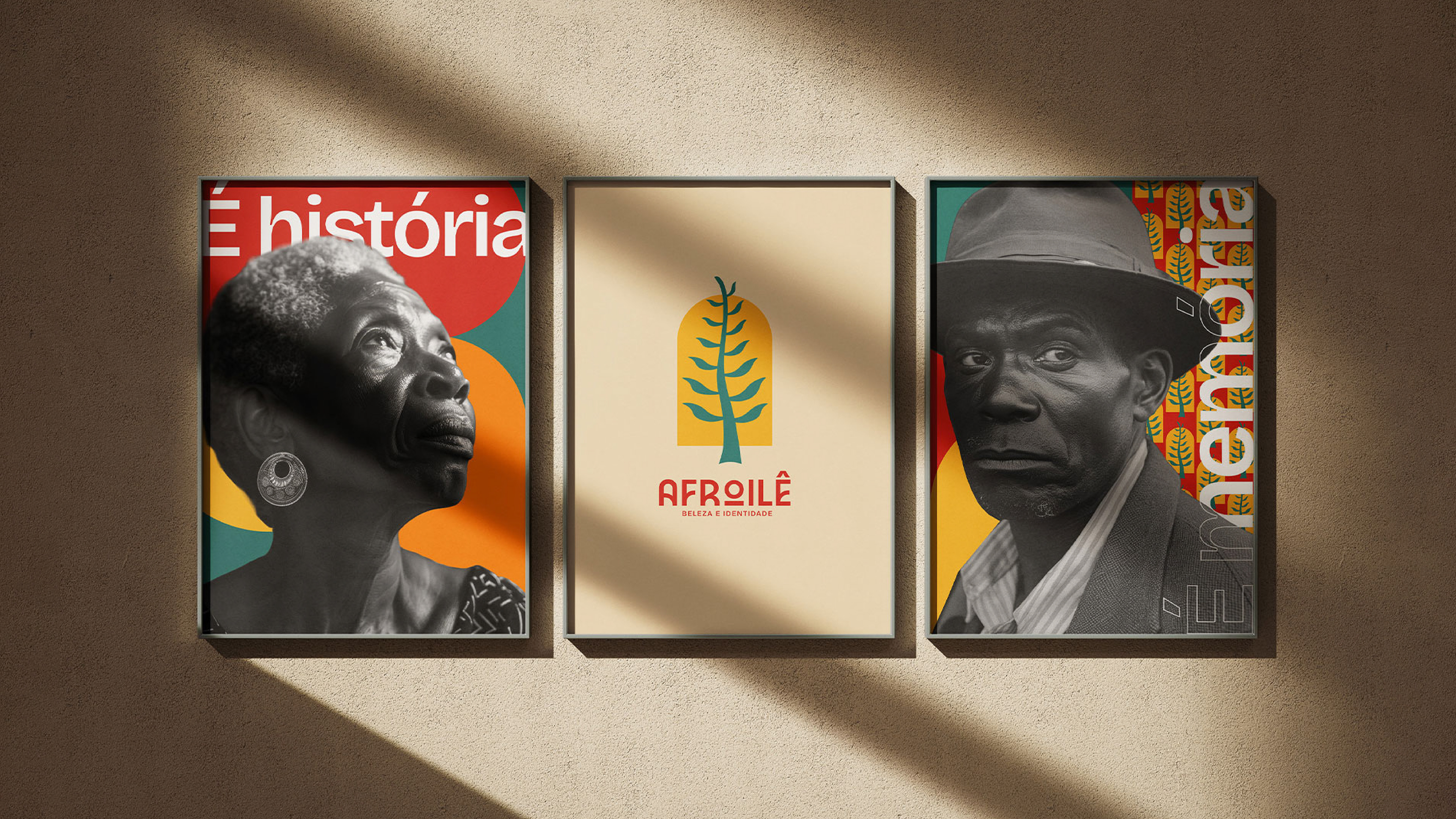
A identidade visual foi construída a partir dessa ideia de casa simbólica. O símbolo principal une:
- A forma inspirada em portas arredondadas, representando acolhimento e acesso
- Referências aos símbolos Adinkra, sistema africano tradicional de comunicação visual ligado a valores e ancestralidade
- Referências aos símbolos Adinkra, sistema africano tradicional de comunicação visual ligado a valores e ancestralidade
Essa construção ajudou a criar uma marca mais conceitual, proprietária e conectada ao significado cultural da empresa.
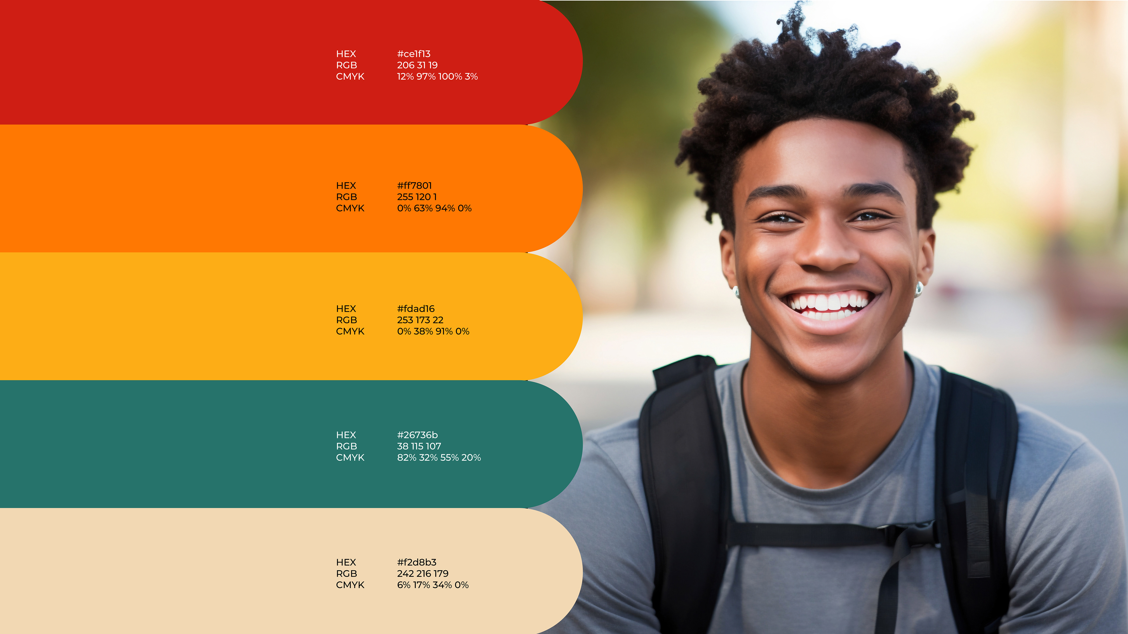
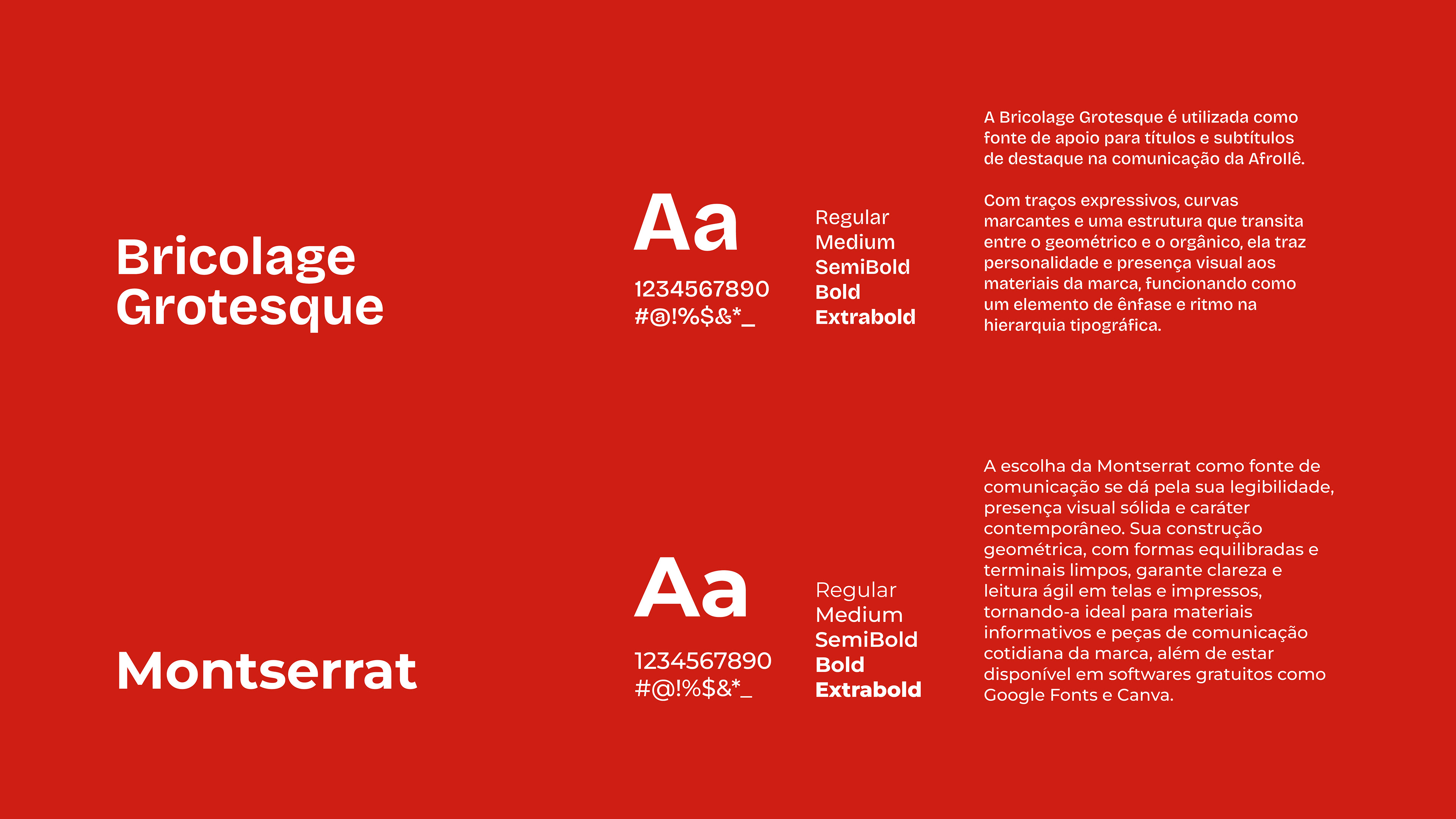
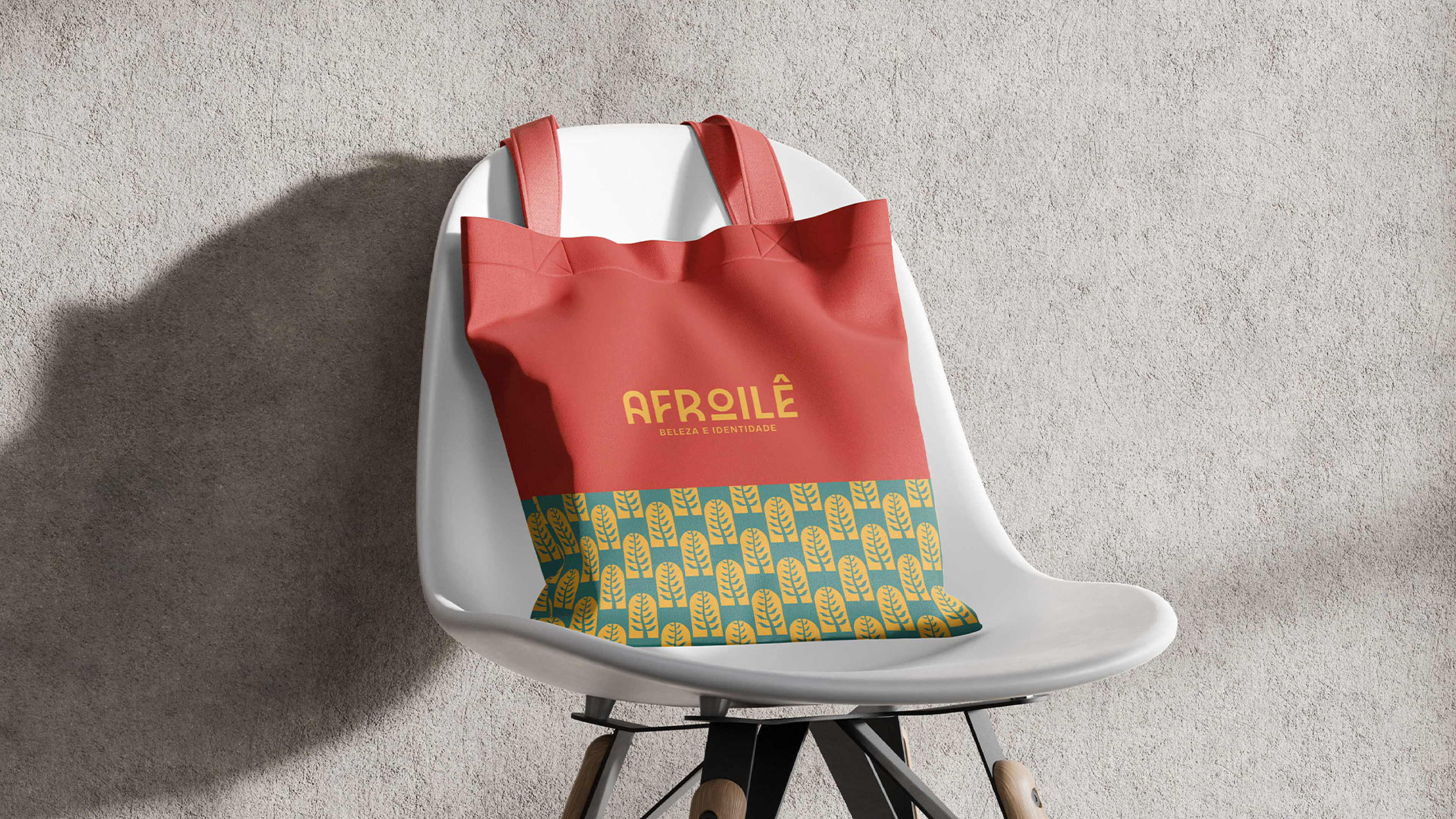
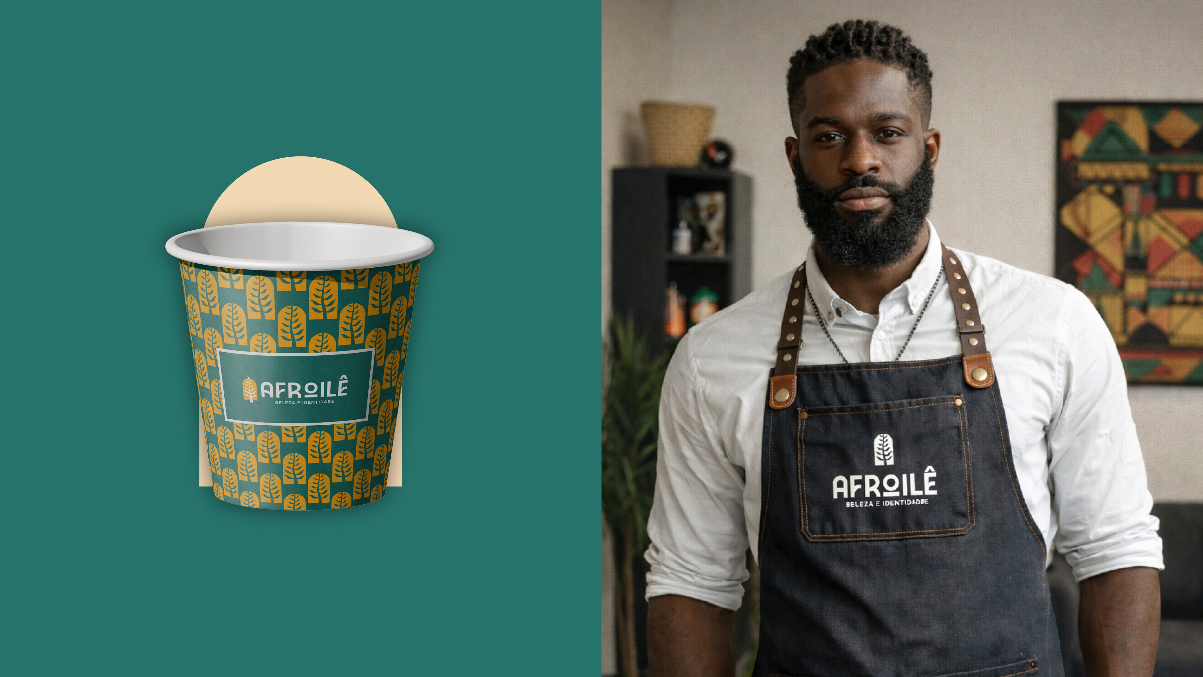
A direção artística também teve papel estratégico no projeto. Trabalhamos uma linguagem visual baseada em contraste, presença tipográfica e cores quentes para transmitir força, identidade e expressão cultural sem perder contemporaneidade.
EN
The project began with the strategic construction of the brand. Starting from the family history, we defined the main pillars of AfroIlê: ancestry, affection, identity, authenticity, and responsibility. These concepts guided all visual and verbal decisions of the project.
The naming itself already carried an important part of the positioning:
- “Afro” linked to Black identity, ancestry, and aesthetics
- “Ilê”, a word of Yoruba origin associated with home, origin, and belonging
- “Ilê”, a word of Yoruba origin associated with home, origin, and belonging
The visual identity was built from this idea of a symbolic home. The main symbol unites:
- The shape inspired by rounded doors, representing welcoming and access
- References to Adinkra symbols, a traditional African system of visual communication linked to values and ancestry
- References to Adinkra symbols, a traditional African system of visual communication linked to values and ancestry
This construction helped create a more conceptual, proprietary brand connected to the company's cultural meaning.
The artistic direction also played a strategic role in the project. We worked with a visual language based on contrast, typographic presence, and warm colors to convey strength, identity, and cultural expression without losing contemporaneity.
PT
Esse projeto reforçou a importância de construir marcas culturais a partir de estratégia, contexto e significado real.
Mais do que desenvolver uma estética visual, o objetivo foi estruturar uma marca capaz de traduzir ancestralidade, pertencimento e identidade em uma comunicação profissional e consistente.
O resultado foi uma identidade preparada para crescer sem perder sua essência familiar, cultural e humana.
EN
This project reinforced the importance of building cultural brands based on strategy, context, and real meaning.
More than developing a visual aesthetic, the goal was to structure a brand capable of translating ancestry, belonging, and identity into professional and consistent communication.
The result was an identity prepared to grow without losing its familial, cultural, and human essence.
Obrigada!
Estratégia e design por Camila Oliveira
Acompanhe nosso trabalho @remakesolucoesvisuais